Getting close with IBM OneUI
I recommended the use of IBM OneUI before including a helper stylesheet. While there is a complete 2.0 documentation (as well as the 2.1 version or v3.0 version) available, a little explanation about the how and why goes a long way. The OneUI is not so much about colours and fonts, but about structure, navigation and layout. Following its guidelines your applications get a consistent look, which user studies show increase user confidence about their ability to use your web application. This translates into less help desk calls. Any consistent framework does that, the advantage of the OneUI is that your applications start looking consistent to the IBM software in use. Furthermore when IBM releases a new visual style, your application can adopt it in no time. Lets have a look at the layout of a OneUI page. It consists of the following structure:

An empty page just containing the layout would look like this:
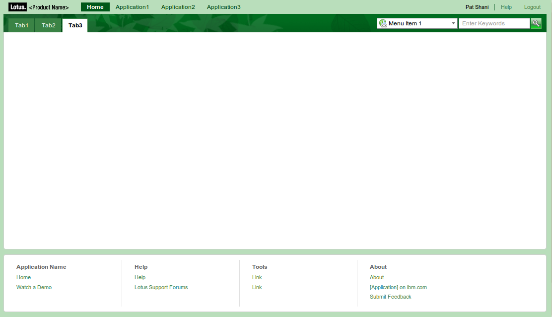
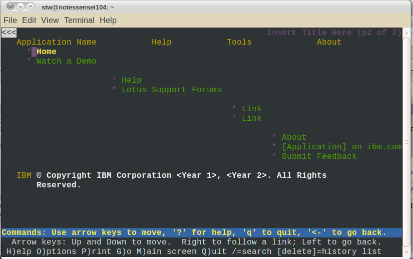
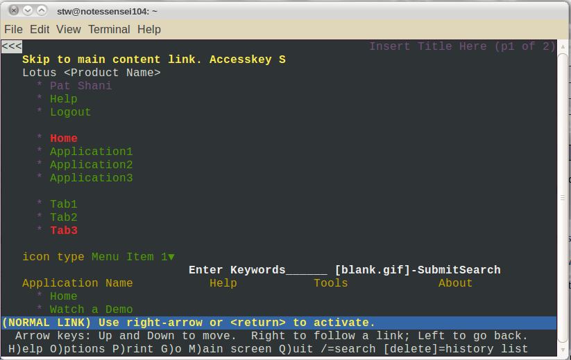
This is also available in blue, red, gold, metal, black and white and it even is usable using Lynx. Branding fanatics will highlight that the logo area is tiny and the footer to long, however nobody stops you from altering the CSS, as long as you stick to the structure (the small logo saves valuable space above the fold). Some Lynx impressions:
One notable feature is the consequent use of Aria tags for accessibility. So how does the structure map into classes? The whole UI is build using a master frame with the class
As usual: YMMV.
- Global Navigation: Branding (corporate and application logo), links to core applications, usern ame, login and help
- Application Navigation: Typically a tab bar on the left and the search box on the right. Search, while potentially acting on the current page content is considered an application level function. You could use a dropdown to allow the user to define the search context
- Place / Page Navigation: Contains the page title on the left and a series of page level actions on the right. A page would be the place where you conclude an entire interaction. This is different from the Notes client or classic web application model where view (selection of information to act on) and document (the instance of information) are usually on different pages. Some rethinking required (Partial page refresh is your friend!)
- Main Content: The main content area has one to three columns where the left and right column are optional. If the main content needs navigation or filtering that would be displayed in the left column with navigation above filters. In the right column contextual information can be displayed (e.g. in a Claim form the right column would show the account summary)
- Footer: The footer area contains logo, copyright and related links that are not frequently uses (e.g. Feedback, documentation, other software)
An empty page just containing the layout would look like this:
This is also available in blue, red, gold, metal, black and white and it even is usable using Lynx. Branding fanatics will highlight that the logo area is tiny and the footer to long, however nobody stops you from altering the CSS, as long as you stick to the structure (the small logo saves valuable space above the fold). Some Lynx impressions:
One notable feature is the consequent use of Aria tags for accessibility. So how does the structure map into classes? The whole UI is build using a master frame with the class
lotusFrame. Everything is inside. This allows to have a background in a theme color and a white content for the page itself. The structure is:
<body class="lotusui tundra">
<div class="lotusFrame">
<div class="lotusBanner"></div>
<div class="lotusTitleBar"></div>
<div class="lotusPlaceBar"></div>
<div class="lotusMain">
<div class="lotusColLeft"></div>
<div class="lotusColRight"></div>
<div class="lotusContent"></div>
</div>
<div class="lotusFooter"></div>
<div class="lotusLegal"></div>
</div>
</body>
Be aware that the column sequence is not like the visual sequence on screen. It is left, right, center. In web pages typically center, left right is more desirable, so the main content renders first, but in web applications having navigation first seems to be a reasonable choice. The body tag has two classes <div class="lotusFrame">
<div class="lotusBanner"></div>
<div class="lotusTitleBar"></div>
<div class="lotusPlaceBar"></div>
<div class="lotusMain">
<div class="lotusColLeft"></div>
<div class="lotusColRight"></div>
<div class="lotusContent"></div>
</div>
<div class="lotusFooter"></div>
<div class="lotusLegal"></div>
</div>
</body>
lotusui and tundra. The first styles OneUI elements, the later Dijit widgets. If you want to use a different Dojo styling you need to change the second value. The structure documentation provides more details including the interna of Banner (a.k.a Global Navigation), Title Bar, Place Bar, Footer, Legal and various versions of content. The structure of the OneUI strongly suggest to move all that DIV tags into their own custom controls sporting an editable area so they serve as containers for your actual content. Steve used that approach in his OpenNTF XPages Framework. Another good implementation of OneUI in XPages can be found in the OpenNTF XPages WIKI template. Further reading can be found in the XPages WIKI. The most complete example for a web application is the interactive example. Looking at the form inside you should clearly get the idea that the old view/document navigation model is outdated.
As usual: YMMV.
Posted by Stephan H Wissel on 17 July 2010 | Comments (6) | categories: XPages
 Thanks Stephan for shering this
