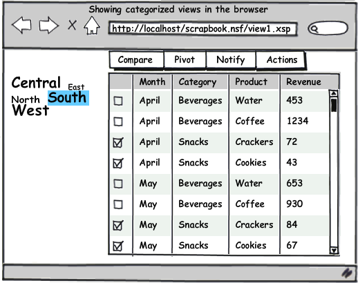
Showing Categorized Views in Web Applications

Categorized views are kind of a trademark of Lotus Notes (Client) applications. We like them, we build them, we love them. We also want to see them on the web. There is only one small issue: That display of information is pretty unique to Notes. You do find this tree/table combination in other applications only to display files (like Nautilus, Finder or KDE) but not data. So a categorized view is kind of odd on the web. I played around to find alternate displays for single and multiple category data. Here is what I came up with.
- Single Category view with Listbox
The category isn't part of the view itself but a picklist on the left (which might be filled by a @DbColumn). The table shows the current selection matching the selection. Works out of the box already today. Interesting extension challenge: allow selection of multiple entries in the listbox.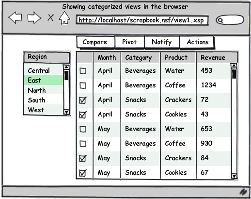
- Single Category view with Combobox
A variation of the first theme. Useful if you have a lot of view columns and need the real estate on the left. Variation: Instead of the dropdown: show a link that uses a popup to allow selection of the category to show.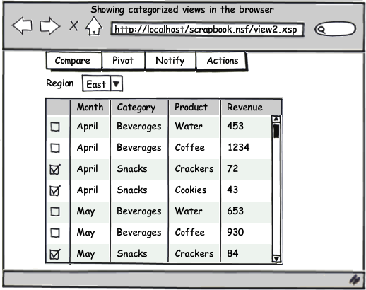
- Multiple Categories with Combobox
This actually works also with a sorted view since the limit key takes an array as entry. As variation similar to the previous example could be to show a breadcrumb link list that allow to click or hover to show the selection. Challenge: How to make it obvious that you need to select/narrow from left to right. Extra challenge: when you change box 2 and the value in box 3 is no longer an available value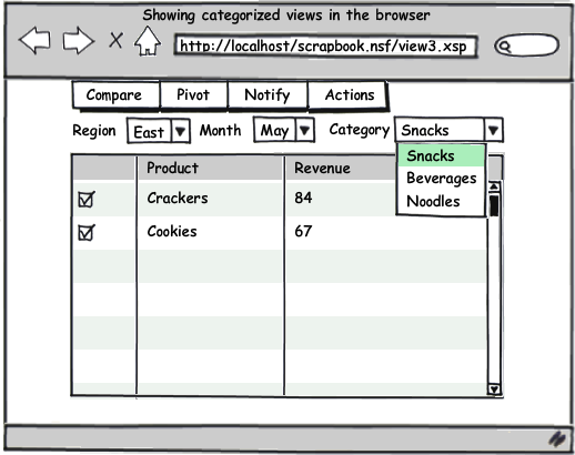
- Multiple Categories in tree/table combination
Looks like a file dialogue, so users should be familiar. You trade horizontal space for vertical space. Makes navigation in categories more accessible since all categories are available any time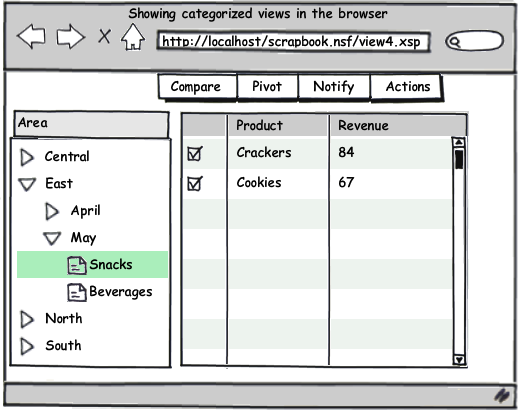
- Pivot view on 3 categories
Category 2 becomes the columns of the table, Category 3 the rows. Adds sums to rows and columns. Good base material for graphs. Challenge: decide on the aggregation mode: sum/average/percentage -or- optional display of such a column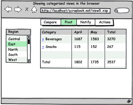
- Pivot view on 3 categories with data rows
Similar concept like the previous but with individual data rows displayed. Might show additional aggregation rows or columns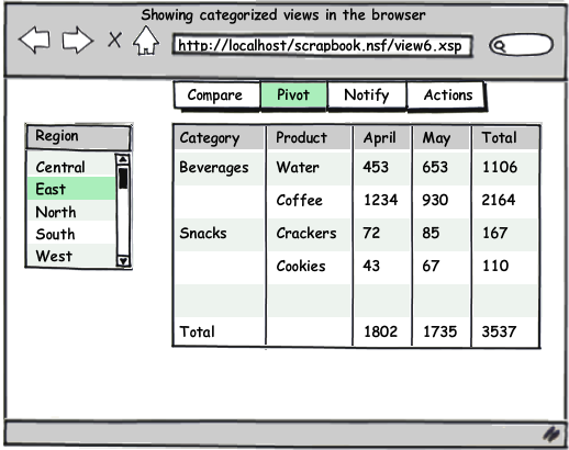
Posted by Stephan H Wissel on 28 July 2009 | Comments (3) | categories: Show-N-Tell Thursday XPages
