wissel.net

Usability - Productivity - Business - The web - Singapore & Twins

Playing with Notes Client form layout

In a recent training session a participant asked why Notes forms are so ugly. Naturally I pointed him to Chris. Nevertheless he got me thinking. How many steps does it take to make a Notes form looking nice. Let us start with a very typical basic form:

Default ugly form

The first thing will be the background for toolbar and form. I borrow some style from Lotus Connections: adding background images leads here:


Next step is to take care of the radio buttons, mandatory fields and the borders.The result is not too bad.
Next iteration
Now I fill the background of the cells and switch off the field delimiters.

Not too bad
As a final step replace the entry helpers with hyperlinks and format the title. I also played with a different button style.
Final Result
As you can see: it takes only a few steps to make good looking forms in the Notes client.

Update: Jane asked how I replaced the entry helpers with hyperlinks. It is a two step process:
First remove the display of the entry helper in the field properties:
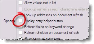
Disable Entry Helper Button
Then add create a new action hotspot (format it blue underline for consistency with Internet standards) and add the appropriate @Prompt function. The hotspot action for region looks like this:
FIELD Region := @Prompt([OkCancelList]:[NoSort];"Select Keywords";"Keywords";Region;"North":"Central":"South")
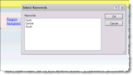
Select Keywords
Please not that you should use "Select Keywords" and "Keywords" for your prompt, so the UI is consistent between mouse clickers and keyboard hitters. Also it is a good idea to use a hidden ComputedForDisplay field to have the keyword field and the prompt draw the same values.

Posted by on 14 November 2007 | Comments (7) | categories: Show-N-Tell Thursday

Comments

  1. posted by Nigel Choh on Friday 16 November 2007 AD:
    Nice stuff. Simpler than what you normally post but much more useful for beginner/intermediate type Notes developers. Would love seeing more immediately useful tips.
  2. posted by Fabian Robok on Friday 16 November 2007 AD:
    Yes, early Java UI components faced the same problem as Notes: How do you cope with multiple platforms, without breaking any platform conventions. I liked the design proposed in the original - now long obsoleted - Java Style Guide, but id didn't have any future.

    On the other hand, the number of different looking GUIs, users have to handle, has not decreased, but increased since (luckily, not the basic concepts, though). Taken aside the approach to add eclipse-like native host looks to NSF based Notes elements (which I don't think is ever going to happen), what school of UI design would you follow for the new standard? Nielsen or Microsoft?

    The only thing that is completely unacceptable in the default design is the look of the radio buttons. Everything else should be down to developer's (or rather corporate) choice.

    Having at hands tools like OpenNTF Viewnify, ToolbarEZ and others is helpful, better CSS support in the client would help even more.
  3. posted by Keith Strickland on Friday 16 November 2007 AD:
    At Chris and Nathan's LotusPhere event last year, they mentioned a website called colourlovers ( http://www.colourlovers.com/ ) which will help picking out a nice color palette, which has always been an issue for me as I have terrible taste/imagination/color vision when it comes to that sort of thing. This way at least I get good colors that compliment each other and really compliments a notes form/application. Quite amazing how adding a little bit of color changes the entire look/feel of a form/application Emoticon smile.gif

    Keith
  4. posted by Slawek Rogulski on Friday 16 November 2007 AD:
    Yes it takes a few steps and with a simple form it even takes a few minutes. Now multiple that by a factor of complexity and some number of forms and you start getting significant effort estimates. And since this is a nice to have it is no wonder that many times you see the vanilla look.

    If I was a cynic I would say that this situation leaves room for someone willing to go the extra mile and easily distinguish themselves (at least on aesthetics). But I wouldn't go that far - I'm no cynic.

    Now, the point is that the default look and options should (or could) be much nicer. Then again if you look at the mail template and the hoops you have to jump to make it look half decent makes me wonder if it is feasible.

    Is it a case of going native like eclipse and providing the host look and feel? Perhaps. Look at the original Swing. They have improved a lot since. But curiously IBM's brain child Eclipse does the native thing.


  5. posted by Slawek Rogulski on Saturday 17 November 2007 AD:
    I certainly do not want to (re)invent yet another GUI, unless perhaps it is a next generation GUI, which is not likely and even that will have it's challenges.
    What I do want is something that looks good (not necessarily great) out of the box. Perhaps provide some themes to choose from to apply consistent and appealing colour schemes.

    Whether it should follow Microsoft (Cooper) or Nielsen I do not know. There is quite a number of complaints that it is not like Windows/Outlook. It is probably the most familiar GUI. Yet Notes is cross platform. Just because it is cross platform (lowest common denominator) does not follow that be definition it is aesthetically challenged.
  6. posted by Jane on Monday 19 November 2007 AD:
    Stephan ... would you explain how you did the last step: "As a final step replace the entry helpers with hyperlinks and format the title. I also played with a different button style."

    Thanks
  7. posted by Budi Febrianto on Tuesday 27 November 2007 AD:
    that is one of my weakness. I can't tell the different between picasso drawing and my 3 years old daughter.
    If I had someone who can create a nice form or view, and that requires a skill and feel.